# Responsive design workshop
**The objectives of this workshop**:
• improve the HTML integration with Flex and Grid properties.
• make the whole thing responsive.
{: .alert-info}
## Initialisation
This workshop is the second part of the [HTML Basics workshop](https://wildcodeschool.github.io/workshop-html-css-basics/).
So you can start from your previous work or [download this version](https://github.com/WildCodeSchool/workshop-html-css-responsive/archive/refs/heads/master.zip) if you are not sure of what you did.
## Layout of your website
You will have to create a basic responsive website following the layout below (**do not try** to be pixel perfect, this image is just a guide).
Open in new tab
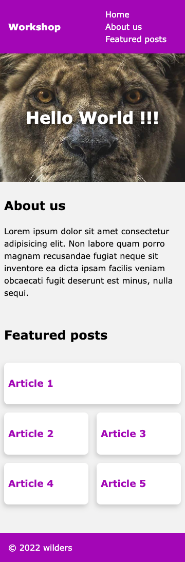
*(The screenshot has been made at 360px viewport width, it is a standard smartphone size).*
### Navbar
- Now for this mobile version, the HTML structure of the navigation bar has not changed but its presentation is different. Reproduce this using **flexbox**.
Reminder:
[Video - Flexbox in 100s](https://www.youtube.com/watch?v=K74l26pE4YA)
[Flexbox basics Cheatsheet](https://jonitrythall.com/content/images/flexboxsheet.pdf)
{: .alert-info}
### Header
- The `` section could be improved too by using **flexbox** to center horizontally but also vertically the ``.
### Featured posts section
Unlike the `About Us` section which doesn't need to be modified here, the `Featured posts` section requires you to add a css class to it.
- Add the `featured-posts` CSS class to this section.
- Add a fifth article in the HTML structure.
- Using CSS grid, create a 2 columns layout. According to the template, the first article will take 2 cells in the grid, others only one.
> Reminder: [CSS Grid basics in 5 minutes](https://www.freecodecamp.org/news/learn-css-grid-in-5-minutes-f582e87b1228).
> Tips: the first article can be targeted with the `:first-of-type` css selector.
## Make it responsive
Add media queries and use CSS functions to obtain the responsive layout below at 1200px.
> You can use a breakpoint at 768px in your media queries (which is a landscape breakpoint of some tablets).
Open in new tab
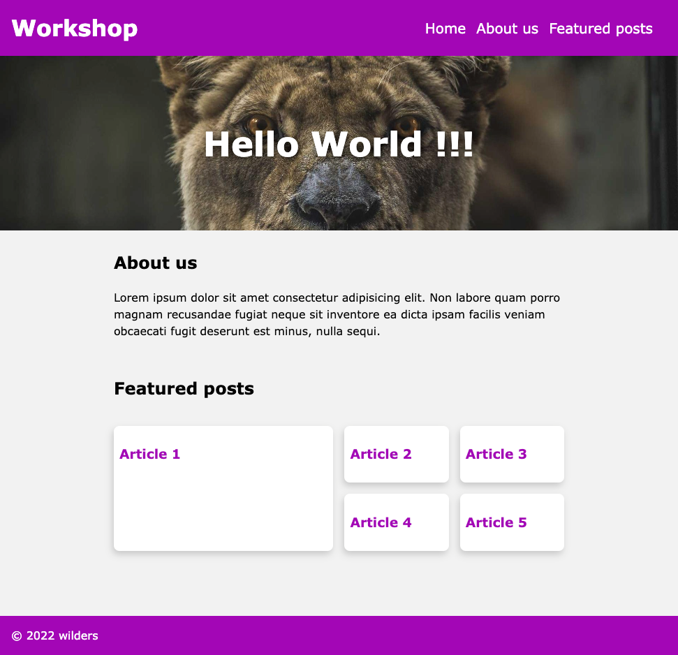
*(The screenshot has been made at 970px viewport width.)*
- Make the navbar responsive.
- Use `clamp()` function to make your `` readable for each size.
- Modify the Grid template to adapt the products horizontally over 4 columns layout but still keep a largest "Article 1" over 2 columns and 2 rows.
> Tips: add this code snippet to your css so that the `` is positioned in a friendly way 😏 .
> ```css
> section.featured-posts h2 {
> grid-column: 1 / -1;
> }
> ```
- Add a `filter: drop-shadow` propertie on the `` of the `` but only for screen media to make sure this effect is excluded from printers context.